How I found my own drawing style (part 2)
Have you ever wondered, how you find your personal drawing style? In search of my own style, I tried out a lot in between manga and realism; I even tried water colours and digital drawing. Over 20 years after my first attempts on comic illustration, I found my sweet spot in realism, portrait drawing and digital art. Here is how I found my own drawing style.
My previous post was dedicated to my dream of becoming a professional mangaka. As stated in the very last sentence, I had to jump two steps back, because I did not get along well with the proportions of manga. My next phase was simplifying the style I had before by leaving out facial expressions. I focussed on outfits, hairdos and the way people act and talk. It helped me a lot to draw faster.
Realism meets a fantasy narrative
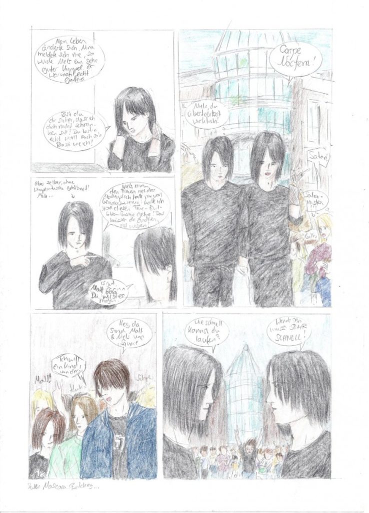
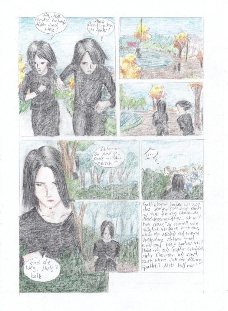
Inspired by high fantasy literature, I created a story questioning today’s society. In 2004, the idea was based on a high fantasy universe and narrative with elves, dragons, knights and magic. With every stroke, I figured out that fantasy was not my thing. I have no idea how mystical creatures move or how to draw magic. Instead, I focused on my main characters and the fantasy story turned into fantastic realism.
In contrast to Satoshi, the panels were in western reading direction. Looking back, I’ve drawn too many panels on one site. Squared A4 paper was not the best idea to start a comic. I used watercolour pencils, but they did not paint over the squares. Therefore, scanning this comic has been a mess.

Seite 2 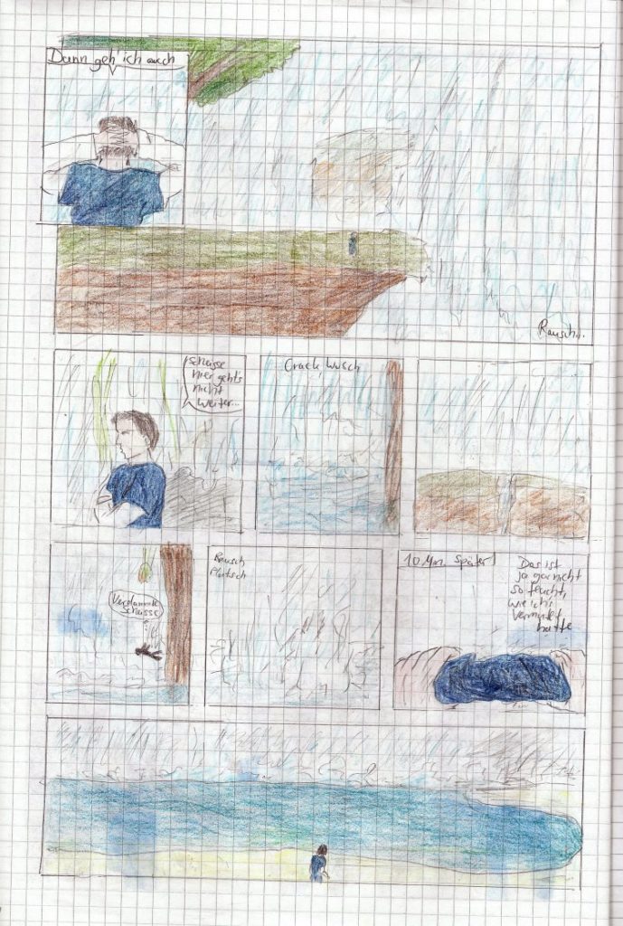
Seite 3
I gave up this comic after 3 volumes with 20 pages each. The story has been too long for a comic or graphic novel anyway. I could have filled 50 volumes, so turning it into a novel was better. Today, this novel is about 1200 pages long and still in progress. I don’t tell the title here, because you’ll hear from it as soon as the book takes shape.
Be Yourself: Colour pencils on blank paper
Learning from the past, my next comic Be Yourself has been drawn on blank paper. It pays, cause this graphic novel has been exhibited and printed in the year 2005. Be Yourself consists of 150 DIN A4 pages and is drawn in the same style as the predecessor. My own style is a kind of simple semi-realism with less contrast. But when we gave it to print, we had real issues with the colour pencils.
Be Yourself tells the story of a young, talented musician, who changed his image to become famous. It’s a story about the rise and fall of a fictive gothic rock band.
Switching to digital drawing
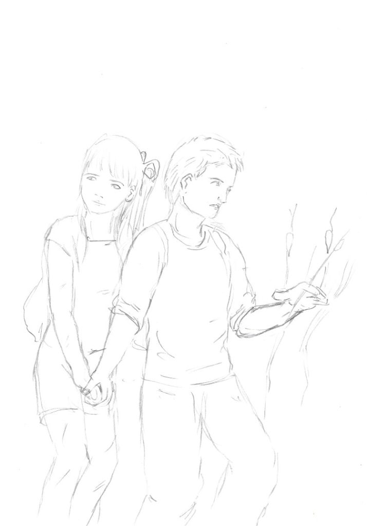
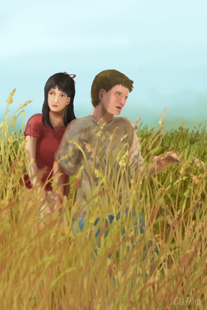
I was really disappointed after seeing the results of my printing, so I searched for a better way to illustrate and make it printer friendly. Somebody on Deviant art told me, that digital drawing is the way to go. This is my first drawing I did with a mouse. The print has been awesome, so I invested in a graphics tablet.
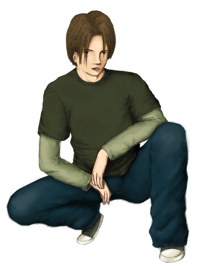
If you’re used to drawing with pencil, pen and paper, digital drawing is a bit difficult in the beginning. Your hands are completely disconnected to the picture, since it is displayed on your monitor. It took me years until my digital artwork was on the same level as my drawing.
Indiepedent: Youth novels and sub cultures
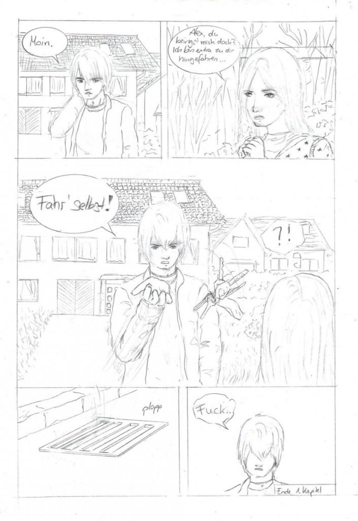
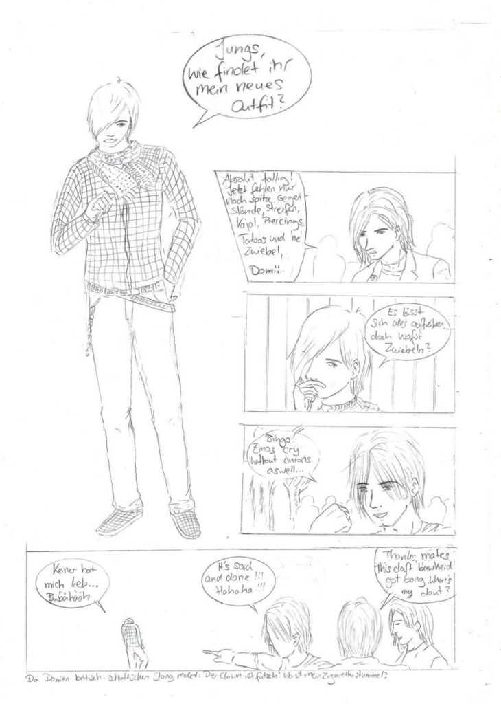
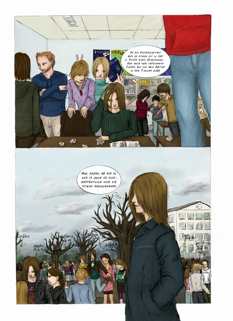
In 2008, I drew another comic called Indiependent. It’s a successor of Be Yourself dealing with music business, sub cultures and youth. In contrast to Be Yourself, which I’d rather call a drama, Indiependent is a comedy. Thus, the narrator of the story is not Matt, but his best friend Alex, who is still a teenager. I’ve translated these two pages for you, to have an idea about the humour.
Translation left page:
Alex: "Hi." (super annoyed)
Jessy: "Alex, can you please bring me to school? I've come all the way here…"
Alex: "(Take the keys) drive for yourself!"
Keys of the car drop into the drain.
Translation right page:
Dom: "Hey, do you like my new outfit?"
Rob: "Super cool. You may need some sharp items, strikes, khol kajal pencils, piercings, tattoos and an onion."
Dom: "I can do that, but… why onions?!"
Gary: "Bingo, Emos cry without onions as well!"
Dom: "Nobody loves me!" (crying)
Gary: "It's said and done, haha!"
Damien: "Thanks mates. This daft bawheid gets boring. Btw, where's my dout?!"
Comment: Part of this scene is in English because there are British exchange students who barely speak German.
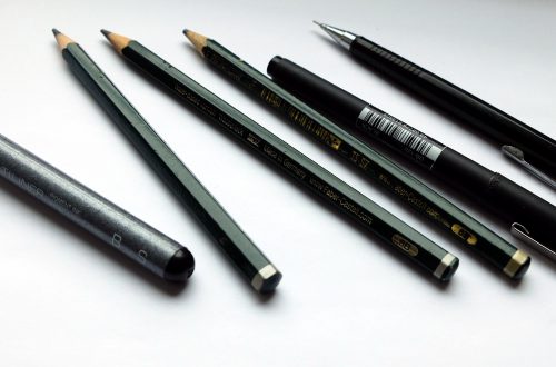
This time, I drew my comic with a HB, 3B and 6B pencil. I figured out, that drawing large size portraits is easier if you use a soft pencil. If you’re interested in this topic, I forward you to this blogpost, where I discuss the advantages and disadvantages of these tools. My own style of drawing adapted once again. With bigger images, I was able to draw facial expressions more easily.
Colouring 4 pages took so much time, that I didn’t finish. My style of drawing is too complex to finish my comic during my lifespan. I still love to see my comic finished in full colour, but I can’t. Who would love to read a comic about subcultures who do not exist any more? I’d continue on that project, if I knew how.
Saving time with illustrations instead of comics
During my studies, I did not have enough time to draw comics. So I started writing novels instead. I missed drawing so much, that I illustrated nearly all important scenes and characters. In 2012 my quality of digital drawing was good enough to present my first artworks. I did not find my own drawing style in digital illustration yet.
Vector art – Abstract ways of realism
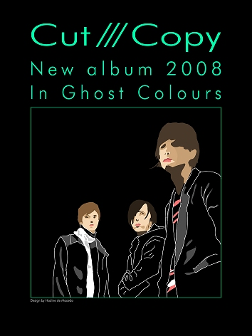
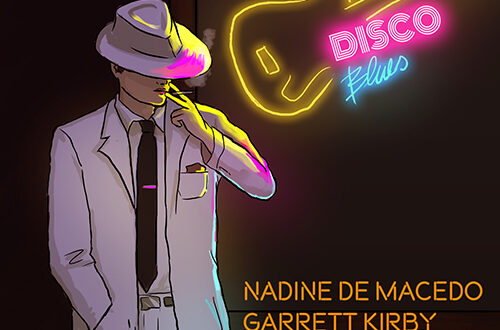
The deeper I got into digital art and illustration, the more I got to know the huge toolbox. Just imagine all that possibilities with brushed looking like textures! Still lacking of time and patience, I came across vector art. Fewer colours, fewer lines, should be easier, I thought. But it ain’t, because you really have to find the right lines to portray a character. My first real vector art has been in 2008, where I participated in a T-Shirt design contest for the Australian electro pop band Cut Copy.
From the technical point of view, vector art and pixel art are completely different approaches. Pixel art consists saves colour information and each pixel, whereas vectors consist of lines and dots with relative coordinates. Vectors scale up with large image sizes, which is not possible with pixel art. The drawing technique is completely different too, because you have to work with Bézier curves and avoid intersections. Getting this right was too much effort, so that I moved back to raster art, but kept the artistic look.
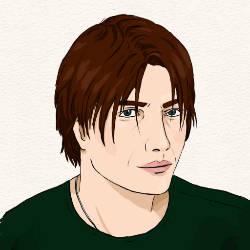
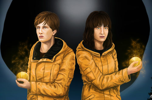
It is a tough job to draw a character with a handful of lines and shades, but I really love this rather minimalistic and still realistic style. Here you can see the same person drawn in a more realistic way. This image took me 20 hours, whereas the vector like illustration was done in 1.5 hours. I have to think a lot about the most relevant traits.
Stunning, how my art developed in over 20 years! If you compare the results with my ideas around 2001, you can still see some traits there. I like realism, but it takes too much time. Basically, all I longed for is an easier and faster way to draw people but preserving realistic features.
Tomorrow: Concept art?
If I had all the time in the world, I’d deep dive into concept art and matte painting. I am a big fan of realistic drawings of nature and characters. They are quite sketch like but super realistic, because they are not so precise in detail, but in light and shade. It’s a long way to get there, and I am not good at drawing architecture and nature. Concept art is a lot about perception and not about detail. It’s quite the opposite of the art I’m doing right now, though some of my paintings are related to concept art.
When I started drawing, I did not think about using a computer and, yes, even liking it more than canvas and paper. Hopefully, this post keeps you motivated to try new things, jump out of your comfort things, explore new realms and get inspired. Do not insist on finding your own style, something that develops after years. Do what is comfy for you, what feels right, and it appears out of a sudden. I do not know if my future art will still be related to realism and vector art like it’s now. Who knows what I’d like to do next?
Which kind of art did you try?
How would you describe your style?



2 Comments
Joseph Rubiano
Honestly, I don’t know if I’m quite more surprised now than before, pretty awesome work!I tried some portrait painting, drawing my sister’s face. I also tried some Manga illustrations, and fruits, but all of that was with a pencil only, without any kind of colour addition, just like your “Independent” art. I always loved that way of painting.
Nowadays, it’s quite strange to know that I don’t like to draw storyboards, despite the fact that I like drawing on paper like for instance Manga and all that stuff.
I have plans to come back at it dowing digitly, perhaps some landscape stuff or something, at least draw the artwork for my future music productions, but firstly I need a drawing tablet, drawing with the mouse is quite stressful.
Cheers!
Nadine
Thank you! I wrote these two blog entries to show that it’s been a long way since everything needs years of practise. I draw much more in my teens and twents, no comparison to today. I tried nearly everything and figured out, that I don’t have the patience to draw ornaments, plants, even jewellery… and I really can’t draw animals. Some years ago, I bought an 800-page book about building humans, livestock etc. with blocks and I just can’t adapt it. So, I decided to stick to portraits, hopefully I’ll be able to draw some architecture or basic landscapes someday soon. I can do this with pencil, but I don’t know how to approach it digitally because I lack of perspective helpers and rulers, especially the ones out of canvas.
Maybe you don’t like storyboards because it’s mostly about finding the right angle and focus. Most of the time, I have the impression that storyboard drafts are a bit overdramatic. The process and technique is interesting though, you can use a lot for comics, manga, novels… basically everything connected with storytelling, motion and concept.
Just keeo your work up. Good luck! A graphics tablet is really worth it.