How to draw a check shirt
Right after posting the cover of The Verge single “Back In Town” somebody asked me on Instagram, how to draw a check shirt. Since it will take a while until my speed painting is ready, I’d like to sketch how to draw plaids, tartan and stuff. While reading this post, you may also learn, why check shirts are so important in rock music and why these patterns are quite hard to draw.
Why do so many rock stars wear check shirts?
First, you may notice that there are plenty of patterns which are spread all over the music scene. While analysing the type of check shirts, you can find out which music is performed by these bands. Tartan is widely spread in the British punk rock scene, whereas American and Canadian emo core and metal core bands wear black-white or black-red plaids. You can also see black-white plaids in the ska punk scene, especially in combination with vivid colours like green or yellow. Lumberjack shirts were typically worn in the 90s grunge scene, but there are plenty of post grunge bands, who seem to like them too.
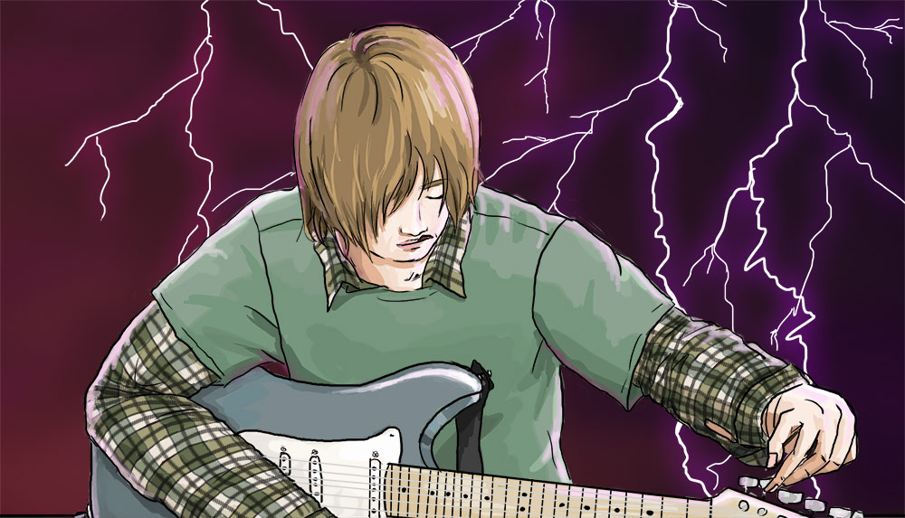
The internet band The Verge titles herself as an alternative rock band. We have a diversified musical background, but you can hear the influences of grunge and punk in our music. Therefore, the young man on the cover of our current single “Back In Town” had to wear a check shirt. Though “Back In Town” is a skate punk song, I have decided to draw him in a grunge outfit. The reason for this was the colour of our logo. The muted greenish olive colour is made for plaids. As some of you may already have noticed, the cover illustrations of The Verge singles are deeply connected to the lyrics.
I have made a video of the process on YouTube, where you can see how I draw the check shirts.
Analysing lumberjack plaids
How to draw a typical lumberjack plaid or check shirt? Many attempts have been made to understand the typical pattern of a flannel check shirt. Having a closer look into this pattern, you may notice, that it consists of two patterns. There are coarse plaids and finer plaids inside them. You need different colours, different line thicknesses and lots of layers to draw plaids. It is best to give each line and colour a new layer.
To draw a check shirt, I had a closer look onto my own flannel check shirt and analyse the plaids. The thickest line is not a thick thread, but a special hatching. You can construct it by using several tilted parallel lines either in black or grey. I used a digital brush for sketching and hatching, modified it a bit and draw the main lines. The best way to achieve a 3D effect is to visualize the body as mesh. Now the drawing looks like this:
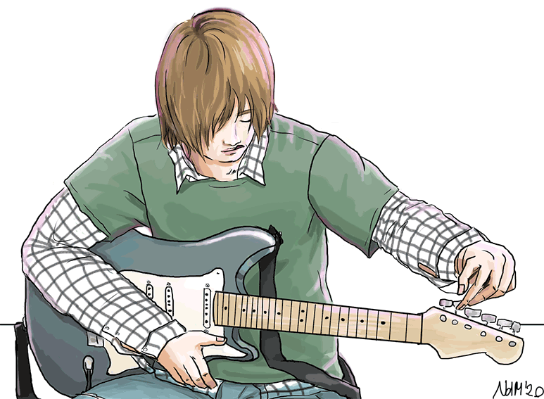
Two kinds of plaids
In the second step, we can subdivide the checks into segments of four. The lumberjack check shirts look way more appealing, if you draw two different colours for either vertical and horizontal lines. In my honest opinion, the best choices for line colours are black, grey, dark blue, dark green, dark red and brown. As I decided this plaid to be olive, one of the lines is dark grey and the other dark blue.
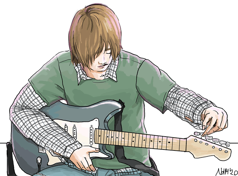
We have finished drawing all lines. The best trick to set these, is to switch the layer mode to multiply and pushing all the line layers to the top. You can play around with the opacity. Please note, that any colouring layer will be under all these multiply line layers.
Use multiply layer effect for a realistic looking plaid pattern
Drawing and colouring all these checks can be quite confusing. Don’t think too much about checks, try to see stripes instead. First, I colour the horizontal stripes. One row olive, the other in a muted beige. You can use the colour you like as long as it is mildly unsaturated and not too dark. The colours you choose should work well together, because they build the fundament of the check shirt.
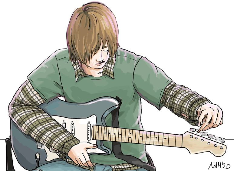
It is very important to follow the lines and to think about details when drawing a check shirt. How many stripes are missed, if the sleeves are rolled up? Is the shirt neatly buttoned? Depending on the scene, it can also happen, that you see parts of the backside. The pattern has to be consistent. I also use this step to fill in some shading.
Now, I hide the horizontal stripes to concentrate on the vertical stripes. I add a new multiplication layer on top of the horizontal stripes and fill in a new colour. This one should be mildly saturated and not too dark. Choose a colour which has a slightly different hue and it not completely complementary. I’ve chosen the greyish green tone of our logo.
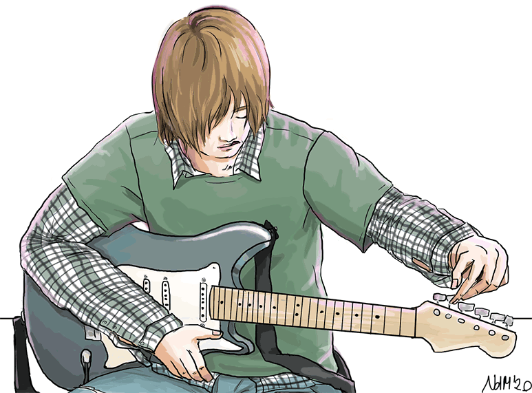
Magic happens, if you set the transparency to something in between 30% and 70%. Make the horizontal stripes visible again. Due to the multiplication effect, the colours on the vertical layer will be added on top of the other colours. This trick does not work, if you’ve chosen a very light and very saturated colour, since white is neutral to multiplication. Now it’s time to play around with opacity until the check shirt looks nice to you.
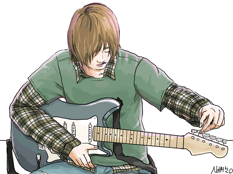
That’s what the illustration looks like after finishing the plaids. I hope that you got some idea, how to draw check shirts and plaids. You can save a lot of time, if you see a plaid as a layered combination of different stripes.
This is only one kind of plaids. The subdivision of the lines may vary. If you want to draw classic tartan, you may subdivide one check into three lines, these three line once again while leaving some of them untouched. It’s best to download pictures of clothing and analyse the divisions and colours. The idea of separating lines and colour layers stays the same.
Why screen tones are not the best way to draw checks and plaids
If you came from Manga or Graphic Novels, you may be used to screen tones. These are transparent self-glueing foils with printed patterns. Many mangaka and illustrators use them to save time. This is a nice technique, if you glue these foils onto flat backgrounds and rigid objects. Using screen tones on clothing and curved objects may end crucial, since screen tones do not follow the curvature of the object. So don’t try to use these foils on living and complex objects, or use irregular and abstract patterns instead.
How do you draw plaids?


