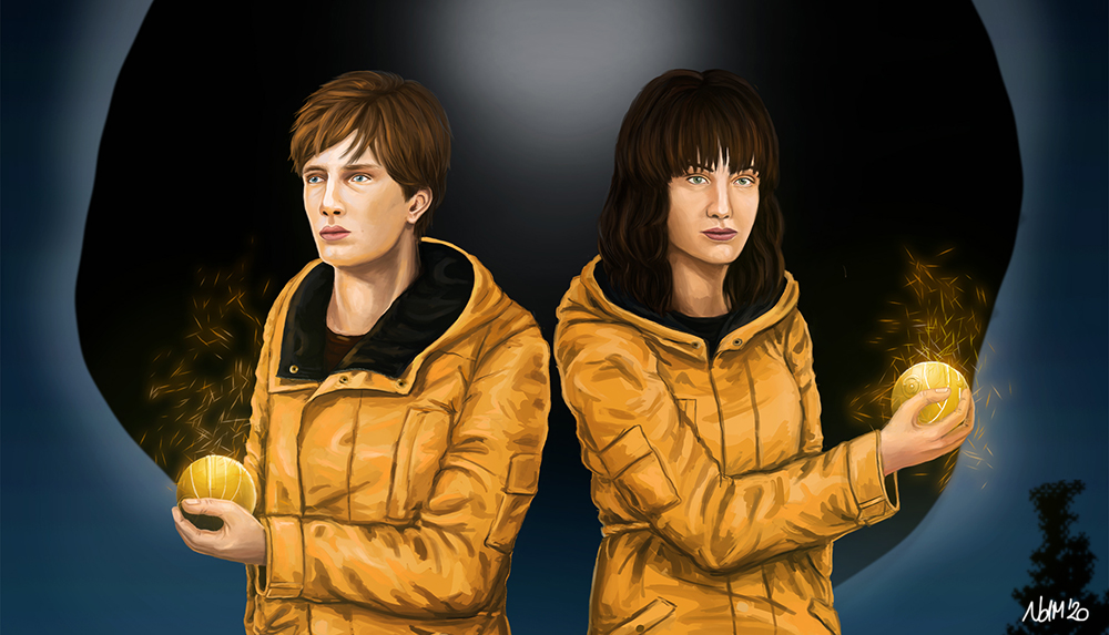
Dark Fan Art – From Comic to Realism
[Advertisement] Have you ever failed drawing a realistic digital portrait? I bet you did. Drawing realism is hard. But here is something, that may embolden you: It is more about observing nature and light than matching the exact shapes and details. In this post I will turn a comic-like illustration of Dark characters Jonas and Martha to a realistic portrait.
In my previous post, you gained some insight in my ideas and concepts of my fan art of Jonas Kahnwald and Martha Nielsen from the Netflix series Dark. This follow-up will give you hints on realistic digital portraits based on a comic-like or vector illustration.
How to draw light, shades and reflexions realistically
Here is the point of this digital portrait painting tutorial:
What makes a digital portrait realistic?
Is it about the details? The textures? I think both, but in my honest opinion catching light is the essential thing to go for, if you’re talking of naturalism and realism.
Colours are not absolute. There is no blue, black or red without the impact of light. Try to imagine colours as a blend of basic colours, shade, reflexions and light. Do not try to match the exact colour – catch the impression. Form and texture will follow automatically.
After some years of observation, I finally found a scheme that worked. I do not know if this is correct, but it’s the way I work today.
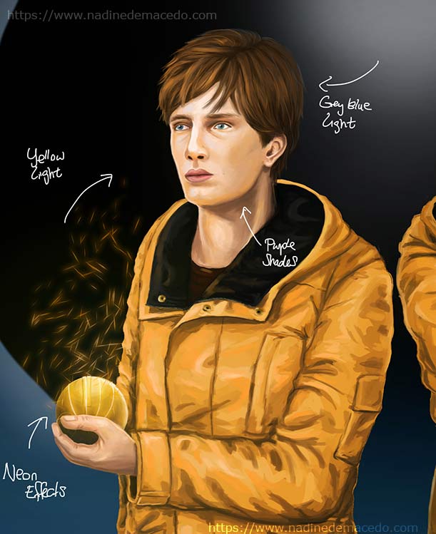
- direct light
Areas, on which the light shines directly, are shaded in light unsaturated colours. The brighter the light, the more saturated the area. You can observe this on the jacket and the thumb. - direct reflexion
I use bright saturated colours on areas with direct reflexion. You can see this on the tip of the nose or the highlights in the eyes. These look so bright, because they are surrounded by less saturated colours. - indirect reflexion of a gleaming source
While shading these areas, I mix a highly saturated colour of the indirect light source. The apricot tone of the cheek is a good example here. You can also see this effect on the bottom of the hand, which is illuminated by the yellow jacket. - shade and indirect light
You can paint a scene in indirect light with unsaturated colours. Shades will be in greyish or taupe undertones. In this picture, the light simulation is quite complicated and intense. Therefore, I tend using complimentary colours for shading. Just watch the neck which is shaded in violet.
At first sight this sounds complicated and poetic. Just give it a try! Take a photo, analyse the light sources and spot them. After some time you may see light blue spots on faces and olive tones in shades. If not, you may visit an exhibition of impressionistic art. Impressionists work a lot with the impression of light and overemphasize them.
Turning an outline into a comic artwork
One of the first steps in drawing illustrations or comics is drawing a neat outline. You may be tempted to fill in your colours here, but wait.
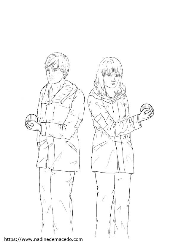
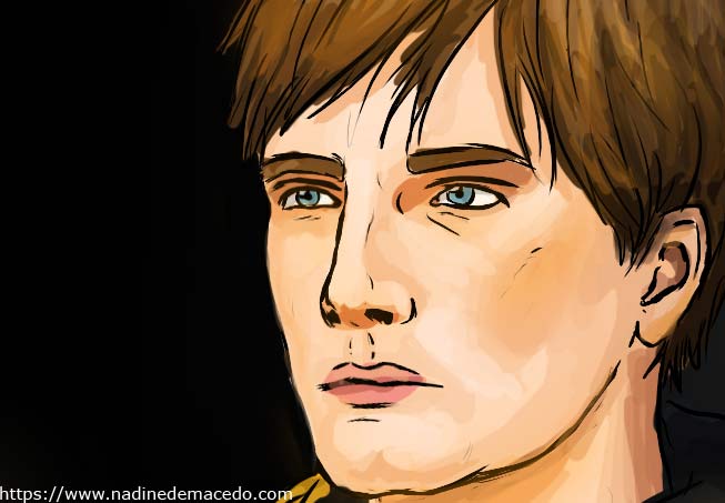
It took me some years to understand, that this is actually a bad idea, if you want your artwork to look realistic. A coloured version of an outlined sketch always looks like a comic or vector illustration. In most cases your neat outline is not good enough for a realistic digital portrait. Proportions are perceived differently when coloured. It would be a waste of time to correct the outlines and the colours. Therefore, I prefer finishing the comic sketch first, before putting any effort to make it as realistic as possible. This is how the artwork looks like after colouring it in a simple way.
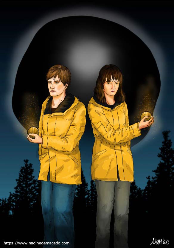
Taking the right pencils for a vector like illustration
In comic-like or vector-like illustrations, one uses other pens and brushes then in realistic or naturalistic drawings. I paint outlines with a hard brush that scales with pressure. Please do not link the pressure sensor to the opacity. While colouring in, I use nearly the same brush!
I achieve the comic-like or vector-like style by using only two to three shades of each colour. I do not mix colours, I pick them from the colour wheel. Lighter shades are taken by shifting the colour to the top and to the left – For darker shades, I shift my base colour to the bottom and to the right. In this way, I gently play around with saturation. I do not change the hue!
You can follow all steps in my YouTube tutorial on digital art or in my last blogpost. Honestly, my way of colouring is a bit unconventional. Professional illustrators tend to shade a picture in greyscales first before fitting in colours. I do not care how you draw and colour your images. It’s the result that counts.
Let us conclude, why this way of drawing reminds us of comics:
- The picture has black inked outlines
- We use only a few colours
- The colours do not reflect the surroundings
- The shades are either high saturated or greyish
How to turn a comic drawing into a realistic digital portrait
It took some years to understand, that drawing realism has nothing to do with details. As I said before, one should focus on the use of light, shade and reflexion. Did you know, that you only need some strokes to make an object look wooden? Neither you don’t have to draw every single hair to catch the impression of hair!
How do you digitally paint a portrait? First, we need to inverse the steps I mentioned above:
- Remove the black inked outlines
- Use more colours
- Mirror the surroundings depending on the texture
- Use shades and textures wisely
Step 1: Soft shades
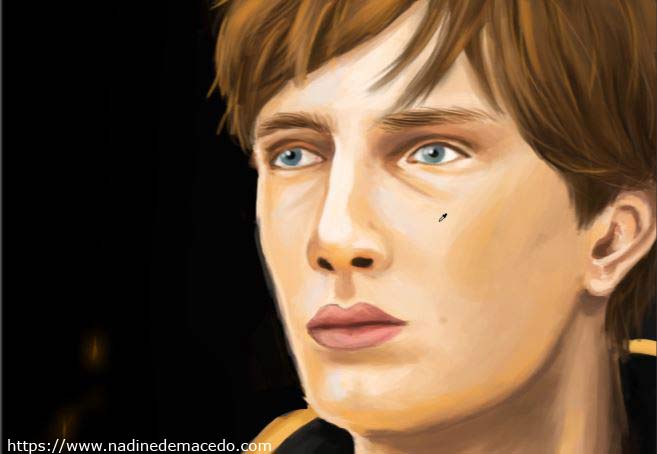
I start with my comic version of Jonas Kahnwald. By applying a large soft brush with 50% opacity, you can smudge out the edges and create softer shades. I usually mix colours of adjacent areas. Just look onto the cheeks, that is the effect I want to achieve.
Step 2: Remove inked outlines
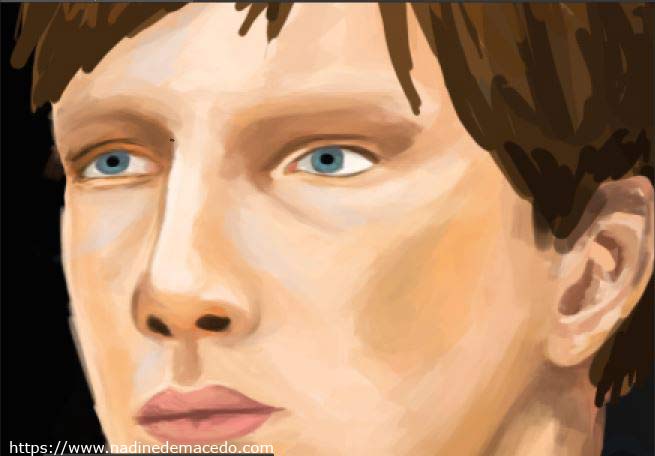
We move to the hardest part of the digital portrait: Removing the harsh outlines. First, I reduce the opacity of my ink layer to something like 20%. Then, I redraw the layers behind the digital ink. I recreate these outlines without using black or any other harsh colour. Use brown, taupe or greyish shades instead. Afterwards I reduce the opacity and recreate the outlines once again. Repeat until the outlines disappear.
The best way to achieve realistic edges is to draw the base a soft brush. Then, I take a darker or lighter colour and sharpen the brush by changing its diameter. The smaller the brush and the higher the contrast, the sharper the edges. You need sharp edges when drawing eyes and ears. It takes some time, until you find the relation that works best for you. It has a lot to do with the age of the people you are portraying. The younger, the softer brushes are used.
While working on a realistic portrait NEVER use black and white. Experiment with colours, blend in soft browns, greys or taupes. Work with different hues and saturation. There are plenty of colours which can look black or white without being exact black or white.
Step 3: Edges, edges, edges…
In my honest opinion, realistic portraying is all about defining edges and light. In this step I have focussed on the eyes. Try to get these edges properly! The eyebrows were drawn with a small sharp pen. When drawing hair is important to follow the natural direction of growth.
Step 4: How to draw hair digitally
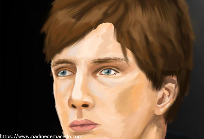
Before drawing hair, I create a new layer. I draw plenty of dabs in different colours. Gaussian Blur is perfect for blending colours. You can already see the effect on the picture before. Here comes my new trick on drawing hair digitally: I use the smudge finger tool. Wait, what?! You can overlay the smudge finger tool with a hair brush. This is a special brush tip that consists of points with different opacity and diameter. I smudge my blurred area in the growth direction of the hair – et voilá
This works fairly well with straight, soft and wavy hair – As long as do not cross paths. It’s a very simple technique!
Step 5: Adding plenty of light effects
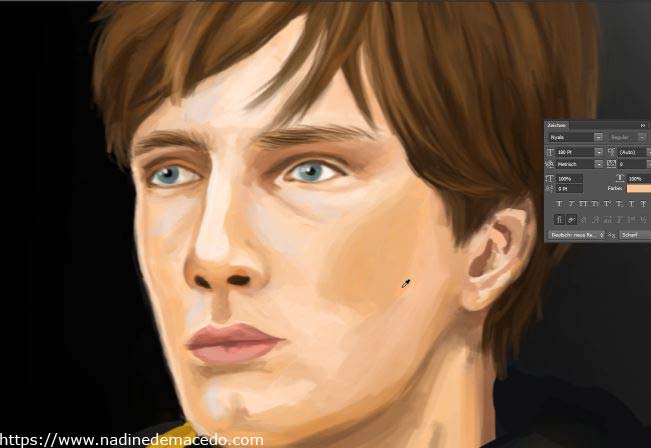
Maybe the result of step 4 looks realistic enough to you. Since Jonas is holding a light emitting metal sphere in his hand (and he’s also wearing a yellow rain coat!), we have to add lots of reflexions. I use a brush with low opacity and high saturation. I share everything yellow and orange, which is close to the light source. Now, the digital portrait of Jonas Kahnwald looks like this.
You don’t have to see the rest of the picture to understand that there might be an intense source of light in the bottom.
Step 6: Once again soft shades
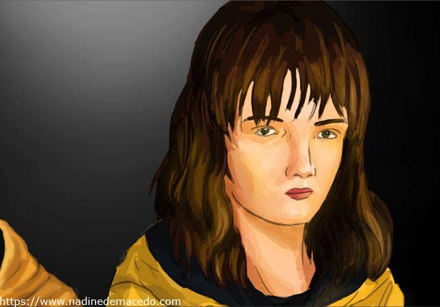
It is time to redraw the digital portrait of Martha Nielsen. Drawing her was really tough, because of her hairdo. We repeat all steps we did on Jonas’ digital portrait starting with adding soft shades. After quite a while my picture of Martha looks like this:
Step 7: Try once again!
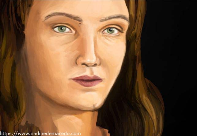
The second step of my drawing tutorial, is to turn the outlines into realistic edges. After two hours of work, this looks quite okay, but this isn’t Martha. Sometimes it is better to open up a new layer and to redraw everything after some days. If you watched the video, you may have noticed, that I mirrored the image quite a few times. It really helps to spot the mistakes.
Another hint: Finish the skin before drawing hair. Draw hair on another layer. Otherwise, it will be difficult to correct the hairdo. You will not draw these eyes once again, right?
Step 8: Drawing plenty of hair
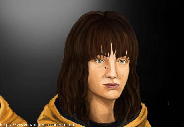
Some days after, my second try of the digital portrait of Martha Nielsen looked way better. I focussed on her nose and the chin. Drawing her hair was really tough. Though using the smudge finger technique of the previous step, it took me hours. Her bangs were hard to draw, but I figured out that the selection tool can be used like a pair of scissors.
Step 9: Softening the textures
The result of step 8 does fairly well, but I do not like these hard strokes in her face. Therefore, I use a soft large brush with low opacity to even out the skin texture. My digital portrait of Martha Nielsen is done.
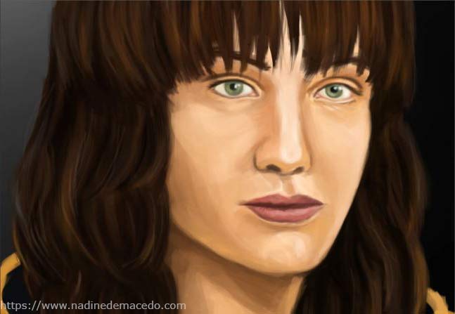
Have you noticed something?
I haven’t used any textures. You don’t have to use textures, when light and shades are well one. Textile can be easily drawn by studying folds. Drawing hair is mainly about catching reflections. The only “texture” I used is a hair brush. I would have been able to draw this picture without it, but it would take twice the time. Besides, the hair brush is a nice tool to draw jeans.
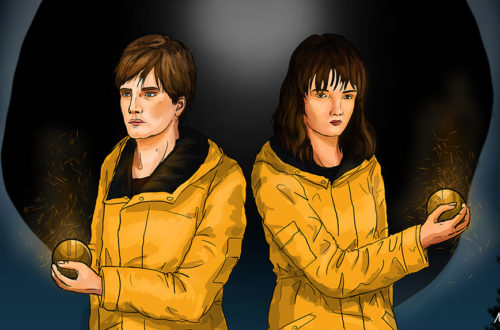
Here is the finished fan art of Dark
In total, drawing this fan art of Martha Nielsen and Jonas Kahnwald took about 15 hours. Do you like the digital portrait?
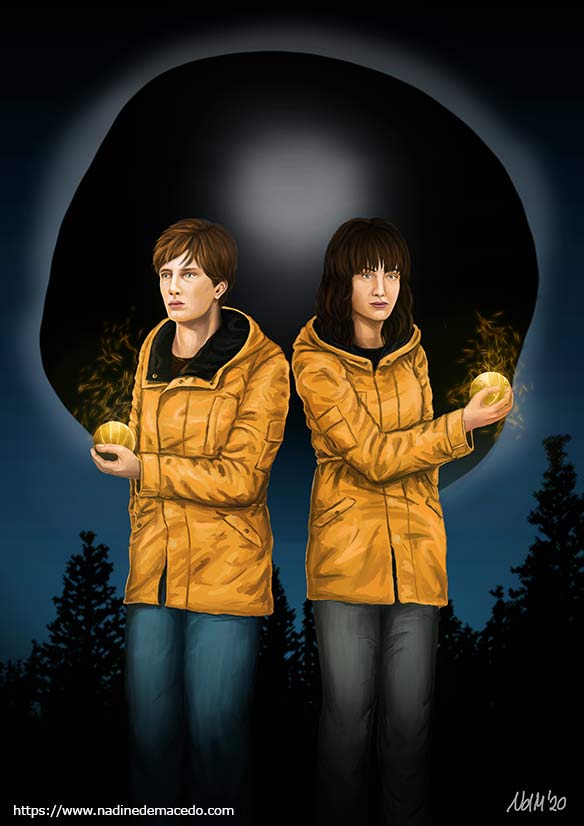
Bonus: How to make draw a glowing antique metal sphere
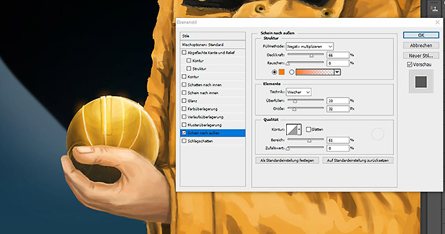
Speaking of tutorials, I found a nice way to draw an antique metal sphere with less effort. Photoshop has an oval selection tool. By pressing CTRL it can be used as a round selection tool. Just fill the selection with plenty of colours in between yellow, olive and brown. The more greyish and olive hues you use, the more antique it looks. I also added the yellow tone of the jacket to it. Gaussian Blur will do the rest for you, if you don’t leave the selection!
How do I make it glow? Well, I just made a new layer with a layer style. In Photoshop there is an option called outer glow. Pick an orangey colour and set the width. Now you draw white lines into the layer – they will glow!
I hope you learned a lot from this article. Drawing portraits with a graphic tablet is tough, but you can learn it faster after understanding the magic of light and shade. Most of all, you have to figure out how to draw edges. I highly recommend watching tutorials for your favourite graphics program and to try out new things.
Have fun with your digital portraits!
P.S. This article had to be tagged as advertising, because it’s about a Netflix series. I do not gain any reward by naming the series, the characters or online offers. This post is about my personal experience with this series combining it with my artwork.
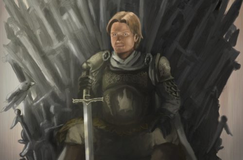
P.S. This picture was drawn with the chalk brush of Walid Feghalis brush pack. I highly recommend this free brush pack, if you want to dive deeper into naturalism, realism or concept art. I also like these brushes for digital portraits.


